Creative Agency:
Co PartnershipProject Type: Produced, Commercial Work Client:
Modus Operandi Brewing CoLocation: Sydney, Australia Packaging Contents: Beer Packaging Materials: Can and label
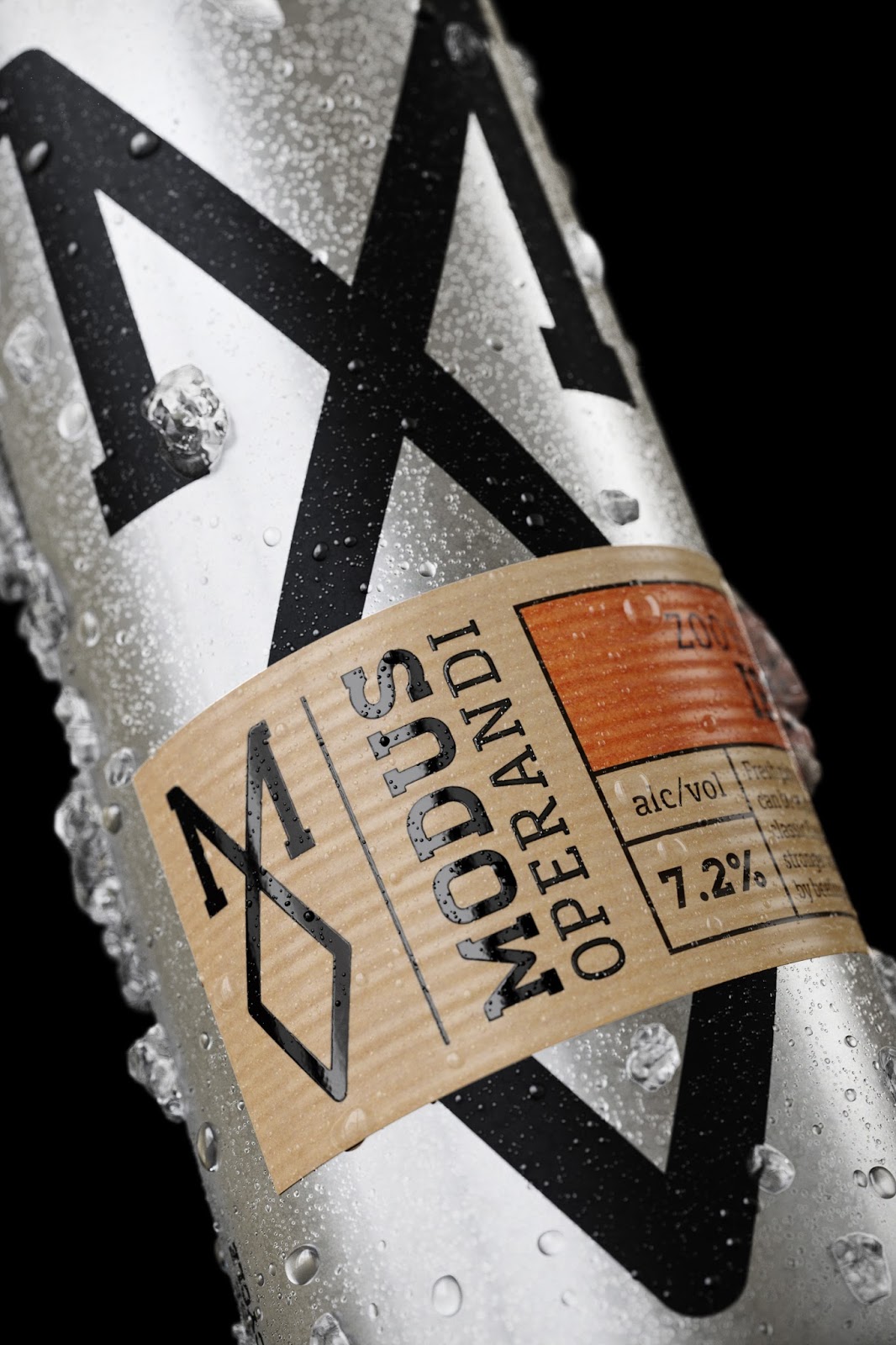
Modus Operandi burst onto the craft beer scene late last year scooping gold awards for their aromatic, flavourful beers made on the Northern Beaches of Sydney, Australia. With a national and international audience rapidly gaining pace, they urgently needed a brand that stood for what they believed in and engaged Co Partnership to help them redefine their voice and brand identity as pioneers of the craft beer scene. Co Partnership tasked themselves to transform the craft beer category, stepping away from the common and saturated codes of craft, images of hops, wheat sheaf’s and distressed type. To do this they first defined the brands reason to believe; 'Beer First. No Shortcuts.’ By beginning the design process with their core belief, they inspired the design and informed the brands point of difference. Each batch of beer is made with the finest quality ingredients, but what makes Modus Operandi different is the yeast; only using live yeast imported from America to reach the quality they are known for. This diligent process of production inspired the Modus mark, a continuous line from start to finish, with no shortcuts. A cult symbol for a brewery defining the future of beer. From here the team worked on extending the brand message. Firstly, the retail cans and tap badges needed a low cost and flexible solution, to keep up with the fast pace of changing products and seasonal experiments. In response, Co Partnership designed a common aluminum can, retaining its raw silver substrate to communicate freshness and modernity in addition to applying a custom kraft label for each beer to the lower part of the can. This was innovative because it applied itself randomly, whilst always at the same height against the can. The overall effect spoke to the industry on two levels; a strong and consistent brand mark repetition with a random element of inconsistency, which spoke to the craft category by appearing hand applied. The aluminum can was finished with a smooth satin, matt varnish which creates a tactile hand feel, in contrast with the rough brown kraft paper for each of the beer personalities. The same thinking was applied to the tap badges. When a bar receives a new beer, rather than manufacturing another costly tap badge, Co Partnership simply created a sticker to apply over the existing metal base. This allowed the brand consistency even when their beer only poured for a day. The brand also opened up their brewery to the public, where drinking areas were planted in the heart of the engine room. To keep in line with this feel, Co Partnership used raw materials such as stainless steel, timber, kraft stocks, screen printing, and heat branded wood across all touch points from signage, apparel, menus, and stationary. With beers and brewers full of personality the team wanted to create opportunities wherever they could for a witty tone of voice to shine through. Copywriting was used to bring the brand to life on beer mats, bar towels, menus and apparel. Rich story telling around the origins of the beer names where crafted to increase the conversation around the brand and drive engagement - success of which was fast reflected on social media, the true test of the brand’s reach.

What's Unique?Quote taken from the project description... "Co Partnership designed a common aluminum can, retaining its raw silver substrate to communicate freshness and modernity in addition to applying a custom kraft label for each beer to the lower part of the can. This was innovative because it applied itself randomly, whilst always at the same height against the can. The overall effect spoke to the industry on two levels; a strong and consistent brand mark repetition with a random element of inconsistency, which spoke to the craft category by appearing hand applied. The aluminum can was finished with a smooth satin, matt varnish which creates a tactile hand feel, in contrast with the rough brown kraft paper for each of the beer personalities. The same thinking was applied to the tap badges. When a bar receives a new beer, rather than manufacturing another costly tap badge, Co Partnership simply created a sticker to apply over the existing metal base. This allowed the brand consistency even when their beer only poured for a day."


 Creative Agency: Co PartnershipProject Type: Produced, Commercial Work Client: Modus Operandi Brewing CoLocation: Sydney, Australia Packaging Contents: Beer Packaging Materials: Can and label


0 comments : Modus Operandi Brewing Co.
Post a Comment